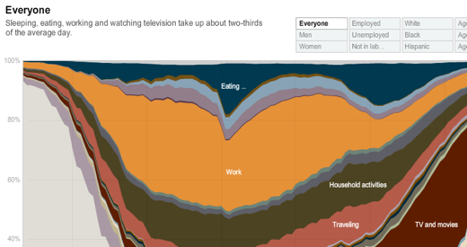
Via @johnmorton, a fun and interesting infographic at NYT to play around with about how Americans spent their day in 2008, according to the American Time Use Survey. Cropped screenshot below:
A couple of interesting things I noted as I flipped between highlighted slices of the graph:
- People without kids work less and watch more tv and movies than people with kids.
- Degrees or no degrees, everyone seems to sleep roughly the same amount of hours.
- On average (across employed and unemployed), people spend 3 hours and 25 minutes on “work”. Slackers.

